Speaking of as normal internet user who doesn’t welcome changes so easily unless required, the question is – Will I welcome with open and embracing heart, the new free email service from Microsoft – Outlook.com?
This is Microsoft’s new flagship web-based email service providing minimalist design, simplicity and faster approach to webmail. Outlook.com is their answer to Google’s Gmail (as for many, gmail has deteriorated over time. Speed of gmail is not the same lightning experience as it was when it had started). As is manifest from the writings on the blog of Microsoft outlook where they have specifically targeted gmail interface drawbacks and promised the clean, intuitive, easy and fast outlook mail experience on the web, on your smartphone and on pc in tightly integrated environment.
The question in first place is – Why did they launch Outlook.com instead of revamping Hotmail ? Why did they launch another email service when providing free email service is outdated phenomenon?
If you ask me, I feel that they launched it to strengthen their existing ecosystem of windows os on pc, tablets and on smartphones (not to forget xbox consoles). SINGLE SIGN IN EXPERIENCE. Since we all are addicted to google services and we enjoy, appreciate and cherish the beautiful integration of email via gmail and other google services on pc, android smartphones, tablets , etc with just one account. Microsoft wanted to do the same but to do it, they had to attract users from other ecosystems. The best way to do this is to build something more intuitive and which could help the transition from other ecosystem easy, rewarding and worthwhile. Furthermore, Microsoft had a bad reputation with Hotmail so they had to build something from scratch and new for optimus effect on users. So, they build Outlook.com and have tried to get rid of all the clutter-shutter of gmail.
I have used outlook.com since its launch earlier today and I appreciate the work of Microsoft. It is faster than gmail, no doubt. It is content-focused as they have made the header, search box and all other tidbits compact providing more space for your inbox mails. The controls and options are so intuitively designed and programmed that it tries to get your job done with minimum interaction i.e. clicks and focus. One more thing I have noticed is that Outlook.com refresh rate is realtime and faster than that of gmail. If I receive a mail on my outlook account, it just shows outright whereas in gmail it takes seconds to update. Other interesting notes include that it pulls up and shows the fb profile picture of all email addresses who have facebook accounts. It has several interesting features and allows you to connect with your facebook friends and twitter’s. Chatting and Video calling are other features very well built into it.
Gmail Versus Outlook Sign up process – An analysis
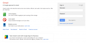
When you visit outlook.com, you’re presented with boxes for filling your login credentials or a signup link below an image. There is also a little text which says – A preview of modern email from Microsoft. That’s it! Is the homepage really convincing enough to turn the visitors into prospective users? When you visit gmail.com, you see details and features of gmail service with text like “Lots of Space”, “Less spam”, “Mobile Access” and links to additional features (new features page) where several of the gmail features and benefits are briefly explained. For a newbie, gmail is more inviting because the description on their page takes a direct approach to familiarize their visitors with exquisites of gmail. Instead of just being visually appealing, Microsoft should have added few lines from their blogpost outlining exquisite features of Outlook. Agree or not ?
Now, taking you to the sign up process of Outlook and Gmail – All the questions and fields required to complete the sign up process are same but here again gmail beats outlook as the signup process on gmail is slightly advanced. On gmail, it measures your password strength in realtime in a visually appealing manner. Further username availability is checked on gmail as soon as you move to the next field so that you could try another name then and there whereas on Outlook, username availability is not checked until you fill all the info and hit on I accept button. On gmail, it automatically detects your country for mobile number input and Country field whereas on Outlook, it doesn’t. So, from homepage to signup process, gmail beats outlook.
The question about whether Outlook is yet another free email service or the best email service stands test of time ! Leave your comments sharing your experience with the new awesome light and modern email service from Microsoft – Outlook.


