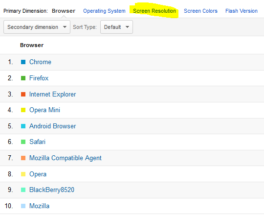
You know how important it is for your awesome website to look good at all screen resolutions. Based on the resolution profile of your valuable visitors, you should optimize your website accordingly. For example, Optimization is required for all screen resolution be it of Mobile phone screens or Full HD 27 inch large monitors but the best presentation must be achieved for the most common screen resolution of your site visitors. As per the trend, most of the websites are now designed keeping in view HD screen resolution but this is not universal. If most of your visitors have 1024*768 screen resolution, you should design your website in such a way that your website should look the best at this particular resolution so that your readers/visitors don’t have to scroll your website horizontally to view the content. You can check screen resolution of website visitors via Google Analytics tool if you’ve already set it up on your site. As previously reported, Mozilla Firefox 15 has included more tools for smart web designers and developers to ease their work. Hard-working web designers had to change their computer resolution to check their website on various resolutions. Further, to check on mobile screen resolutions, they had to open the website on mobile devices. This was pretty difficult if the website project is on local offline server setup. So comes the easiest solution – Firefox Responsive Design view. Here in this article, we’ll see how to check our website at various screen resolution without the need of changing the resolution of computer.
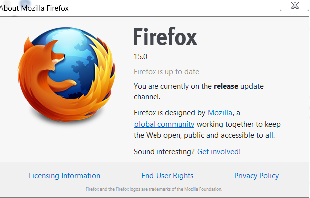
- Launch Firefox browser probably Firefox 15 or higher .
- Go to firefox menu – web developer – Responsive design view. Alternately, you may press ctrl+shift+M.
- Now open your website. Change the resolution by selecting from the list available in dropdown menu.
- To check your website on Mobile from the computer itself, just change the resolution to 360*640 or 320*480. If your website theme has mobile devices support. It’ll automatically render to mobile version of your website. This way you can check your website for mobile devices – like appearance on your pc without using any mobile browser. Hit on Rotate button to check it in Landscape mode similar to that of Mobile. This way you can switch to mobile-optimized version of any website on pc.

- If you want to check your website for how it looks on 1024*768 resolution, just select 768*1024 and click on Rotate button.

- Press Esc to close Responsive Design view and return to normal surfing mode.


Make your excellent content easy on eyes! Your website design and ease of use will likely convert your visitors into your loyal readers or customers. Well-crafted design not only improves the usability of any website but also increases your stand for higher ranking in Google or other search engines. Keep reading our well-designed blog for more web designer related tools and utilities and don’t forget to check other useful web developer options in Firefox menu.
Great post, thanks!